Wednesday 6 May 2015

Context of Practice End of Module Evaluation

1. What skills have you developed through this module and how effectively do you think you have applied them?

I have learnt how to look deeper into the meaning of an image or article through discourse analysis with the use of referencing. Taking apart an image relating to my subject in this way has taught me to unpick all of the themes, questions and intentions surrounding the image, ultimately increasing my interest and understanding.  This has helped me to gain a stronger ability to find a solution to a problem through research by being more speculative towards the initial issue. I have also developed my presentational skills through delivering a pecha kucha presentation with restricted limits on time, which has allowed me to pick out the most important points that I want to get across to my audience with more efficiency.

2. What approaches to/methods of research have you developed and how have they informed your practical outcomes?

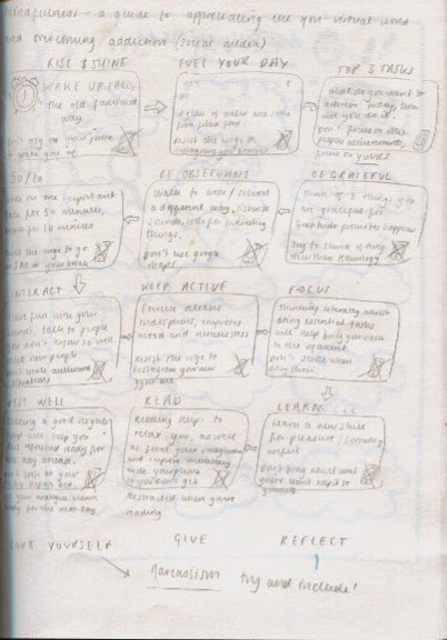
I have used the library to gain academic references to my subject, which has also allowed me to read further into the context and history of social media and technology. Because both areas of development are so widely accessible, I was able to analyse other peoples interaction on a daily basis, as well as carry out my own experiments to test my ability to resist using social media, learning and reflecting from it. Experience based learning helped me to develop and understand why it was that people can become so addicted to using technology and social media, and I used these habits triggers to come up with a positive alternative solution through my visual diagram.

3. What strengths can you identify in your work and how have/will you capitalise on these in the future?

I think that I have put across my points in my essay in a balanced way, with a good structure and wide spectrum of questions surrounding the issue. Also, over the course of this module I have become really interested and passionate about the way that social media and technology have negatively impacted society and I have become enthusiastic towards raising awareness about the problems that it can cause, which is evident in my visual diagram. I have made sure that my visual diagram focused on mindfulness is really informative and highlights the negative habits that come from using social media too much, and suggested a positive alternative, that if practised enough will help improve the viewer’s day, and ultimately their wellbeing. I will capitalise on these points by continuing to be speculative towards my question title, and look at it with a balanced view to avoid my research being too personal and biased.

4. What weaknesses can you identify in your work and how will you address these in the future?

My biggest weakness is that my Pecha Kucha wasn't as efficient as it could have been, in the way that I didn’t address a solution to the problem within the presentation, and didn’t directly get to the point in the way that I’d hoped it would. At the beginning I focused a lot on the history of the development of technology and social media in general, rather than starting at the beginning of MY understanding of the issue, by including the initial stages of research, books I read etc. In the future, I will definitely ensure that I address the problem clearly, AND address possible solutions, rather than leaving it at an open end.


5. Identify five things that will benefit you in next years CoP module:

  • Choose more of a QUESTION to study, rather than an open ended statement, this way I will really be able to sink my teeth into it and gain more interesting results.
  • Push myself out of my comfort zone to gain more speculative, and more experience based research.
  • Read more journals, newspapers, books in general to improve my language and vocabulary.
  • Express myself visually about how I feel about my subject- produce more sketchbook drawings to amplify my thoughts, to help improve my understanding.
  • Allow more time in my timetable to develop my COP work, rather than leaving it on the back burner.

6. How would you grade yourself in the following areas:

Attendance:4
Punctuality:5
Motivation:3
Commitment:3
Quantity of work produced:3
Quality of work produced:4
Contribution to the group:3

Monday 4 May 2015

More Development of Visual Diagram

Problem Solving

In response to my worry about my diagram not being 'visual' enough, I drew out some little icons for each point in the diagram, to make it look more interesting as well as interact more with the audience.


The most important icon is the mobile phone with the cross through on every point in the diagram, advising the viewer how to pursue and enjoy the activity without using technology and social media.


I then traced around my little icons and added them to the diagram; I had to do a lot of re-shuffling and re-sizing to get them to fit in appropriately.


Feedback

At this stage, I asked a few of my peers to have a look at my diagram to see what they thought and a few of them suggested that I add some arrows in to show the flow of the diagram, otherwise it looked as if it was set out in columns as opposed to a flow chart.


The Final Diagram


Reflection

I am pleased with the outcome of my visual diagram considering how worried I was that it didn't include enough visual elements. The space used is rather jam-packed and busy and can look a bit chaotic from a distance, but that was a better alternative to not including all of the information that was required.

I have carefully taken into consideration the text and colour used within the diagram to fit under the calm, uplifting theme of mindfulness.

My diagram is a positive thought and action based solution to the wide scale problem of society being addicted to using social media and technology, which has resulted in problems such as laziness, becoming more antisociable (ironically), narcassism, obesity, ignorance and many more including mental health issues. I identified some of the key reasons why society might be so addicted to engaging in this kind of activity, some of which being that it is free, and so easily accessible. 
As a solution to this problem, I realised that practicing mindfulness is just as cost-free and easily accessible, and could encourage us to appreciate the real world more than the virtual world.

In each cloud section, I have listed a productive, uplifting activity that could improve an average persons day, and over an extended period of time have an impact on their wellbeing. By listing a negative technology and social media based alternative/ instruction against using underneath each specific cloud, I have highlighted the negative areas and effects that they could lead to.

I hope that others will view my diagram and think twice about how much they engage in using technology and social media, and be informed about how practicing mindfulness on a daily basis can improve their overall mental and physical wellbeing.

Sunday 3 May 2015

Continued Development of Visual Diagram

Visual Quality

I decided to add some colour to my diagram; blue seemed suitable as it is a calm, soothing colour, which relates well to the topic of mindfulness. I had some trouble trying to work the gradient tool on illustrator, but through using the 'help' option it was easier to navigate.


I had an idea that instead of using the boring, mundane boxes around each information point, I could use clouds to represent 'thought bubbles', often illustrated to show that someone is thinking.


Problem Analysis

I used a textured line similar to that in the chalk dust font, to give the impression that it has been hand drawn. I am pleased with the way the diagram is looking so far, although I have a few slight concerns that I haven't used enough imagery in comparison to text, when the intention is supposed to be a visual diagram...

This is something that I need to further explore and experiment with in the upcoming stages of development.


Saturday 2 May 2015

Poster Design

Rough Draft

The rough idea for my visual diagram is a flow chart on acts of mindfulness that can help people appreciate the real world without engaging in social media.


I am having some serious qualms with this poster!!

I have laid out how I would like my diagram to look, but I feel like it looks so DULL. Obviously I will make changes to the typeface and colour, possibly with the addition of illustrations, but I am just panicking a little at this stage...

The poster with all of the information that I wish to include; I just need to make it more visually appealing now!

Testing Typefaces

Choosing a typeface is proving challenging; I need something that isn't too harsh and militant as mindfulness is a peaceful, uplifting  practice, but something not too 'airy fairy' or people will not take it seriously.


Noteworthy: A good option, although I am not so keen on the way that the title looks, maybe spacing it out a little will help.


Chalkduster: I love the texture of chalkduster, it is very playful, although the wide set letters somehow remind me of the type that would be used on an Indian takeaway menu... A bit of experimentation may help.


Tekton Pro: This font is OK, somehow doesn't quite fit the bill though.


I am pleased with the way that my diagram looks using the Chalkduster typeface. It is easy on the eye and informative simultaneously. 

Friday 1 May 2015

Further Research into Mindfulness

In the stages of planning more ideas for my visual diagram, I had a look at some diagrams and info graphics focused on mindfulness to gain some inspiration.

-Note how none of these encourage engaging in technology and social media! as a solution-


Monthly challenge

Focuses on one task per day, something manageable and achievable.


Daily Challenges

Small, helpful tasks and actions are also manageable and achievable. Maybe the latter has a little TOO many things, and can feel slightly over whelming. The first info graphic is a little more achievable and straight forward.

What to do from this point

I need to think about the point I want to get across about how practicing mindfulness can improve our wellbeing, rather than relying on the 'easy way out' source of entertainment by engaging heavily in social media and technology.

How will I incorporate the dangers of social media into a poster about mindfulness? Do I need to look at the dangers, or just focus on mindfulness?