Saturday 25 October 2014

Discourse Analysis Feedback

In groups of three we read each other's essays and gave feedback on to how we performed on each criteria. It was really interesting to see how the other people in my group had structured their essays and interpreted their illustrations. Reading my feedback I was happy to hear that responded well to the criteria giving a detailed analysis of each point, resulting in a clear discourse of the picture, 'mental health apps'.


To improve, I could have gone into more depth about what was happening in society in 2012 to gain a more thorough understanding of what could have influenced Lowndes in his development of the illustration. I also could have talked more about why Lowndes might have chosen his specific colour scheme, what the colours might mean and what they might represent.

Thinking about themes and discourses for further development, I could compare society today with society before technology 'took over'. I have been thinking about looking into how the development of technology has made us become less sociable and more isolated, and how we prefer to create online avatars of ourselves through social media, that often indicate a 'false identity' in comparison with the way the 'real world' sees us.

Wednesday 22 October 2014

Discourse Analysis

Mental Health Apps- Making People Appy- Nick Lowndes

‘Mental Health Apps’ was produced in 2012 as an editorial illustration for the cover of the mental health magazine ‘Therapy Today’. At present, technology is rapidly on the increase in terms of development and consumer usage, where by instance mobile phone apps are being created for almost every purpose. This image illustrates future prospects of apps being used for Cognitive Behaviour Therapies used to treat people suffering from mental health problems.
Lowndes states that most of his work consists of the process of transferring hand drawn images to digital format and digital tools including adobe photoshop and illustrator to enhance the initial sketches.  Therapy today is the official journal of the British Association for Counselling and Psychotherapy, and this particular image features on the front of the magazine of the April 2012 Issue 3 Volume 23 copy to accompany the feature article by Phil Topham entitled ‘Making People Appy’.  In terms of medium, Therapy today is a printed magazine predominantly edited by Sarah Browne and Catherine Jackson targeted at the audience of counselling and psychotherapy professionals, and those interested in therapy.
The image presents two burgundy silhouette forms of people sitting face to face engaging in a counselling session. The therapist on the right half of the photograph is concealed within a black outlined frame of an iPad/ tablet with a red background that matches the shade of the chair that the patient, on the left hand side is sitting in. The main background and frame of the image consists of a plain teal square, which contrasts with the shades of red.
The therapist concealed within the iPad illustrates the subject of the article: future prospects for apps being created to help people suffering from mental health problems, as opposed to actually physically going to a counselling session. The title of the article, ‘Making People Appy’ is a play on words meaning that the general use of apps is rapidly increasing, and the concept that going to see a councillor is ultimately a solution to a problem, resulting in being happier.
In some ways you could argue that the image presents a message that in years to come apps will have more value than people themselves, in terms of creating an app to provide a function that a human would normally carry out, in this instant being a psychotherapist. As a generalisation, society  is becoming more isolated and engaged with their mobile phones as opposed to going and finding things out for themselves, and actually communicating with others because it is simply easier and quicker to reach into their pockets, pull out a mobile phone and solve the issue almost instantly with the push of a few buttons.
The words that I associate with this illustration include: therapy, counselling, technology, future, apps, society, replacement and isolation, which is a mixture of verbs and adjectives. These common features suggest a theme of future prospects for society, resulting in a futuristic, preparatory language being used in logic that we can’t control or don’t know what will happen in the future.

In conclusion, ‘Mental Health Apps’ is an editorial piece of illustration designed for the cover of ‘Therapy Today’ magazine to draw attention to the feature article entitled ‘Making People Appy’. In a simplistic and direct form, the image communicates the prospects of apps being created in the future to aid people suffering from mental health issues. On a wider scale, this relates to current issues of people engaging more with technology than people themselves, and the idea of apps replacing human functions and society as a whole becoming more isolated. 

Wednesday 15 October 2014

Keyword Investigation


Society

What is society? The aggregate of people living together in a more or less ordered community.

I intend to explore how technology and social media have influenced society today and affected our own perceptions of identity alongside our general well-being.


This image entitled 'sockpuppetry', derived from getty images (couldn't find the illustrator reference) explains the ancient term, meaning using false identities for perception. 

The internet and social media has become a shield for physical interaction, and nowadays we create avatars online to make a virtual representation for ourselves. These are subconsciously designed to shape others ideas about who we really are, hence creating a false identity. This manipulates others perceptions of us to increase personal self worth and always strive to 'be the best', which is an act of deception; this is where the term sockpupperty comes from because our deceiving behaviour mimics that of a puppet master. 

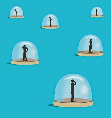
I also looked at the work of Nick Lowndes. I am really interested by his concepts to do with a broad view of society.

Unheard Voices
I have interpreted this illustration in terms of self isolation. That
every man is our for himself and that we are so obsessed and self 
centred that we cannot physically hear each other. We are drifting away
from unity and collaborating with other people because everyone is 
desperate to strive to be the better man.
Therapy Today- Mental Health Apps
To me, this illustration shows the rising issue of technology 
replacing the role of human communication, interaction and in
this instance careers. This suggests that in years to come, 
mental health support will be available in the form of an app
as opposed to seeking verbal advice from a therapist, which is 
somewhat daunting. The thought of gaining the support for 
extremely sensitive and emotional issues that we suffer with from
a technological device is absolutely absurd, but this could
indeed become the norm in the future.

A History of Type

If you imagine a two-way venn diagram between visual communication and verbal communication, writing falls into the overlap. 
Typography is a combination of meta-communication, para-linguistics and kinesics (physical gestures), and is a modernist obsession. Each typeface has a different culture and family.

Writing started in the middle east and slowly progressed occidentally and orientally until the whole world was familiar with it. In particular the Romans, they set in stone (literally) the foundations for both numbers and letters. Trojans Column 113AD consists of elements of the Roman alphabet, which we still use to this day.

The 'late age of print' began around 1450, the time of the enlightenment which was the cultural movement of intellectuals, which moved on from tradition.


Here are some examples of popular typefaces through the following eras:
  • Old style/Classical 1450-1700
  • Transitional 1700-1790
  • Modern/Didone 1790-1870
  • Swiss Modern and Bauhaus 1870-1960
  • Contemporary 1960-2000

In this timeline of type,it shows that the older fonts represent handmade fonts. They are connotations of sophistication, classics and renaissance. Old style/humanist type faces date back shortly after Gutenberg's adoption of the movable type printing press.

When modern consumer culture emerged and so did the modern type face with fewer references to handwriting. 'Slab serif' fonts became very popular, attempting aggressive print that stood out. They were often referred to as 'Egyptian' fonts as a bit of a red-herring. People were interested in Egypt at the time, it had not relation but it was just to signify something unusual.

In the 1800's the speed of life rapidly increased. So many things seemed to happen at once, including industrialisation, mass urbanisation, new inventions, transport, telephones etc. 

When modern 'Sans Serif' (without the serifs) type faces began to emerge so did a futuristic, neutral message with no references to any cultures past. It was looking to the future, a modernist message that was to convey the future development of society. It was to be a progressive font, not a black letter gothic font, to distil the essence of modern image.


In 1926, Eric Gill created 'Gill Sans', which was the epitome of English Modernity. Gill sans was used on a wide scale, including the BBC logo, the London Underground and other public transport, Penguin books etc.

However when 'Times New Roman' was created around ten years later specifically for The Times newspaper, it was the opposite of what modernists were trying to do.

An important thing to remember is that the choice of font is vital. For example, the Nazi's hated modern fonts. In their propaganda they used Gothic black letter fonts. Goths dominated Europe in the dark ages, and the Germans used this to signify power.

'Helvetica' was created in 1957 by Max Miedinger, it was the signiature font of swiss graphic designers, however microsoft released 'Arial' 25 years after and completely ripped it off!

To conclude, all type faces have different connotations. 


Saturday 11 October 2014

Visual Literacy


In our first lecture, we learned that visual literacy is the language of design. 

As illustrators our job is to communicate, we solve problems of communication through type and image.

The difference between visual literacy and visual communication is that visual communication is a process of sending and receiving messages using type and image based on a level or shared understanding of shapes, signs symbols etc. Whereas visual literacy is the idea that pictures can be read. The ability to construct meaning from visual images and type.

We also learned some more in depth key words to do with visual literacy:

Visual Syntax is a 'pictorial structure and visual organisation of elements', basically the building blocks of a picture for example framing, format, colour, font, tone, layout etc, and the way that we read that picture.

Visual Semantics is the way an image fits into a cultural process of communication and how a relationship between form and meaning is developed. Also how the meaning is passed on in terms of design. An example of this is the code of road signs, how red triangles signify warnings, how red circles give orders and how unique shapes such as the upside down gives a command, in this instance 'give way'.

Visual Semiotics is the study of signs and sign processes, closely related to linguistics, which is studying the structure and meaning of language.

Looking further into visual semiotics, we learned about image representation and language in three forms:

Visual Synechdoche: The main subject is simply substituted for something inherently connected to it, for example when a part is used to represent the whole, or vice versa.

Visual Metonym: A symbolic image that is used to make  reference to something with a more literal meaning, like association as opposed to an actual link. For example most people when they think of a yellow cab they automatically think 'NEW YORK', but yellow cabs don't MEAN New York.

Visual Metaphor: Used to transfer the meaning of one image to another. So this means to compare or convey an impression about something unfamiliar and associating it with something familiar.


To conclude, I have gained a better understanding of how messages are communicated through image in a deeper sense, and how we are wired to automatically make connections and assumptions through looking further into the structure of an image. Also how that it is necessary for any language to exist that there must be an agreement between people that one thing will stand for another.


Sunday 5 October 2014

Monkey Mind

Monkey Mind- 150.195
As a starting point to exploring one of the five key themes,
I picked up a few books to do with Culture and Society,one 
being 'Monkey Mind', which is a told experience of one 
individual living and coping with anxiety. I believe we live
in a culture that is generally becoming more narrow minded 
hence the reason there is a huge stigma around people that
struggle with mental illnesses. On this topic, I could start
to explore how people might gain relief through viewing
therapeutic images. This also may include illustrations
that raise awareness about mental illnesses and help people
gain a better understanding.