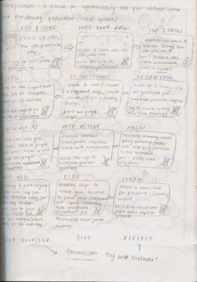
The rough idea for my visual diagram is a flow chart on acts of mindfulness that can help people appreciate the real world without engaging in social media.
I am having some serious qualms with this poster!!
I have laid out how I would like my diagram to look, but I feel like it looks so DULL. Obviously I will make changes to the typeface and colour, possibly with the addition of illustrations, but I am just panicking a little at this stage...
The poster with all of the information that I wish to include; I just need to make it more visually appealing now!
Testing Typefaces
Choosing a typeface is proving challenging; I need something that isn't too harsh and militant as mindfulness is a peaceful, uplifting practice, but something not too 'airy fairy' or people will not take it seriously.
Noteworthy: A good option, although I am not so keen on the way that the title looks, maybe spacing it out a little will help.
Chalkduster: I love the texture of chalkduster, it is very playful, although the wide set letters somehow remind me of the type that would be used on an Indian takeaway menu... A bit of experimentation may help.
Tekton Pro: This font is OK, somehow doesn't quite fit the bill though.
I am pleased with the way that my diagram looks using the Chalkduster typeface. It is easy on the eye and informative simultaneously.


No comments:
Post a Comment