Visual Quality
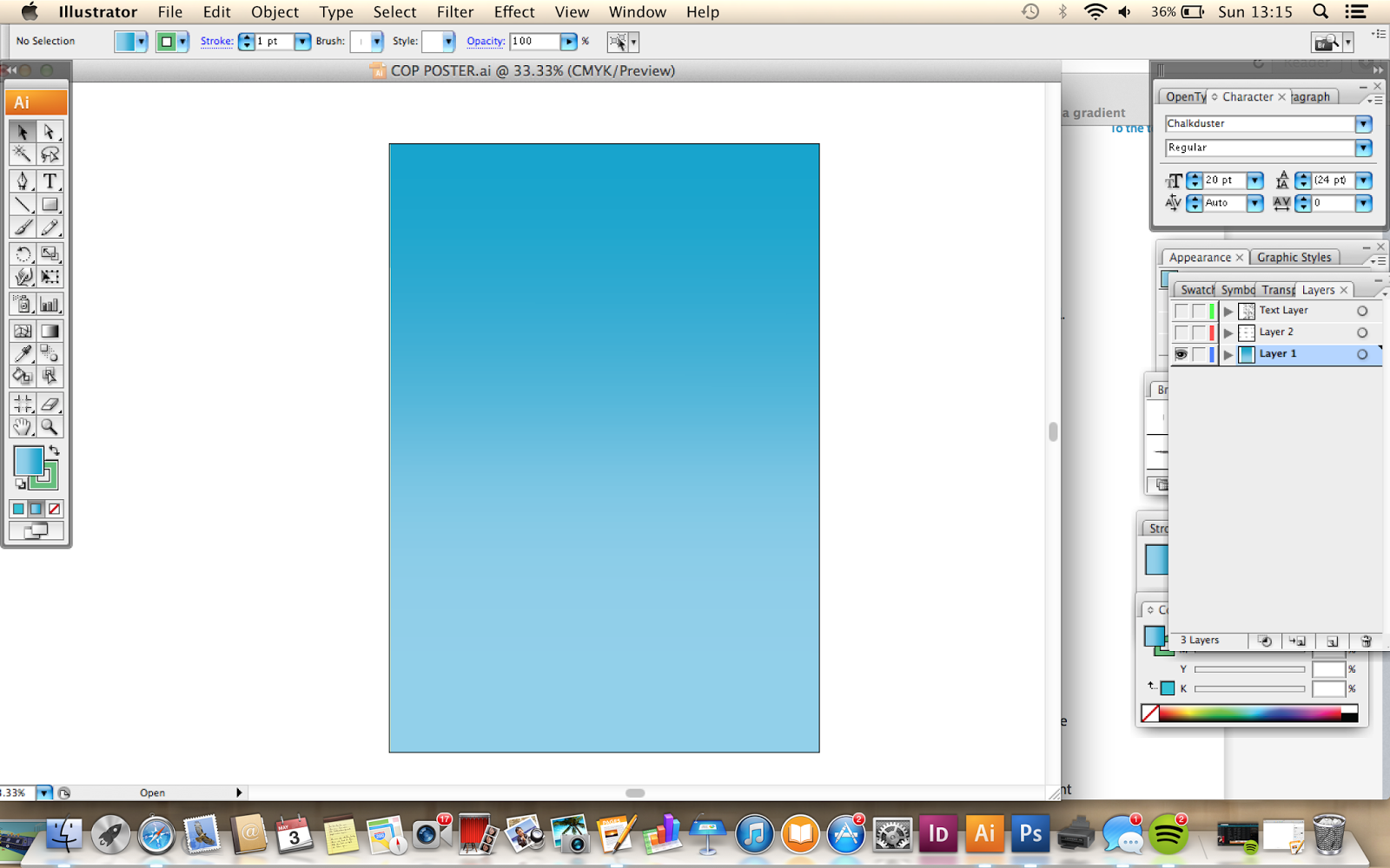
I decided to add some colour to my diagram; blue seemed suitable as it is a calm, soothing colour, which relates well to the topic of mindfulness. I had some trouble trying to work the gradient tool on illustrator, but through using the 'help' option it was easier to navigate.
I had an idea that instead of using the boring, mundane boxes around each information point, I could use clouds to represent 'thought bubbles', often illustrated to show that someone is thinking.
Problem Analysis
I used a textured line similar to that in the chalk dust font, to give the impression that it has been hand drawn. I am pleased with the way the diagram is looking so far, although I have a few slight concerns that I haven't used enough imagery in comparison to text, when the intention is supposed to be a visual diagram...
This is something that I need to further explore and experiment with in the upcoming stages of development.


No comments:
Post a Comment